Create Your Pure CSS Floating Labels for Input Fields
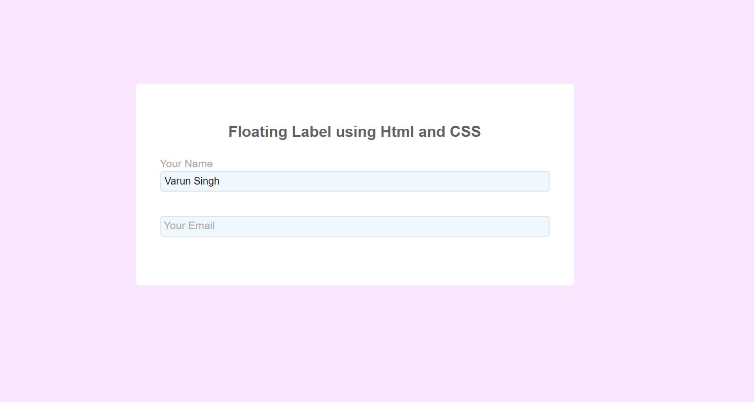
You have probably seen Floating Label Input Fields. It’s an input that appears as if it has placeholder text in it, but when you click/tap into that input, that text moves out of the way and allows you to type there.
Many of the demos I’ve seen involve JavaScript. But I did not a simple code for this. Here I am going to implemets this using HTML and CSS using few line of code.
Floating Label Input Fields:
Structure Of File:
- File -> index.html
- File -> style.css
index.html:
In this file I have used style.css for giving the look and feel with some effects to our html file.
<?php
<html>
<head>
<link rel="stylesheet" href="style.css">
</head>

<body>
<div class="container">
<h3>Floating Label using Html and CSS</h3>
<div class="form-group">
<input type="text" class="form-control" placeholder="Varun Singh"
id="name" name="name" >
<label for="name" class="form-label">Your Name</label>
</div>

<div class="form-group">
<input type="email" class="form-control" placeholder="varun@o2inc.net"
id="email" name="email">
<label for="email" class="form-label">Your Email</label>
</div>
</div>
</body>
</html>
?>
style.css:
This file is used for giving the structure for html contents with some effects.
body{
    display: flex;
    justify-content: center;
    align-items: center;
    height: 100vh;
    font-family: "Raleway", sans-serif;
    background-color: #F9E5FE;
}
h3{
	font-size: 20px;
	color:#626162;
	text-align: center;
	margin-bottom:40px;
}
.container{
    width: 40vw;
    padding: 2em;
    background-color: #fff;
    border-radius: 5px;
}

.form-group{
    margin-bottom: 1em;
    transition: all .3s;
}

.form-label{
    font-size: 14px;
    color:#aaa;
    display: block;
    opacity: 1;
    transform: translateY(-1.6em);
    transform-origin: 0 2;
    transition: all .3s;
    padding-left: 5px;
}

.form-control{
    box-shadow: none;
    background-color: aliceblue;
    border-color: #ccc;
    width:100%;
    transition: all .5s;
    padding: 5px;
	border: 1px solid #E3E2E3;
	border-radius:4px;
}

.form-control::placeholder{
    color: transparent;
}

.form-control:focus{
    box-shadow: none;
    outline: none;
    border-color: antiquewhite;
}

.form-control:focus + .form-label,
.form-control:not(:placeholder-shown) + .form-label
{
    transform: translateY(-3.2em);
    padding-left: 0px;
}

.form-group:focus-within{
    transform: scale(1.01,1.01);
}